Lament Magazine
Editorial Design | Branding | Type Design
2018 - 2019
ardcove
Italian
1971


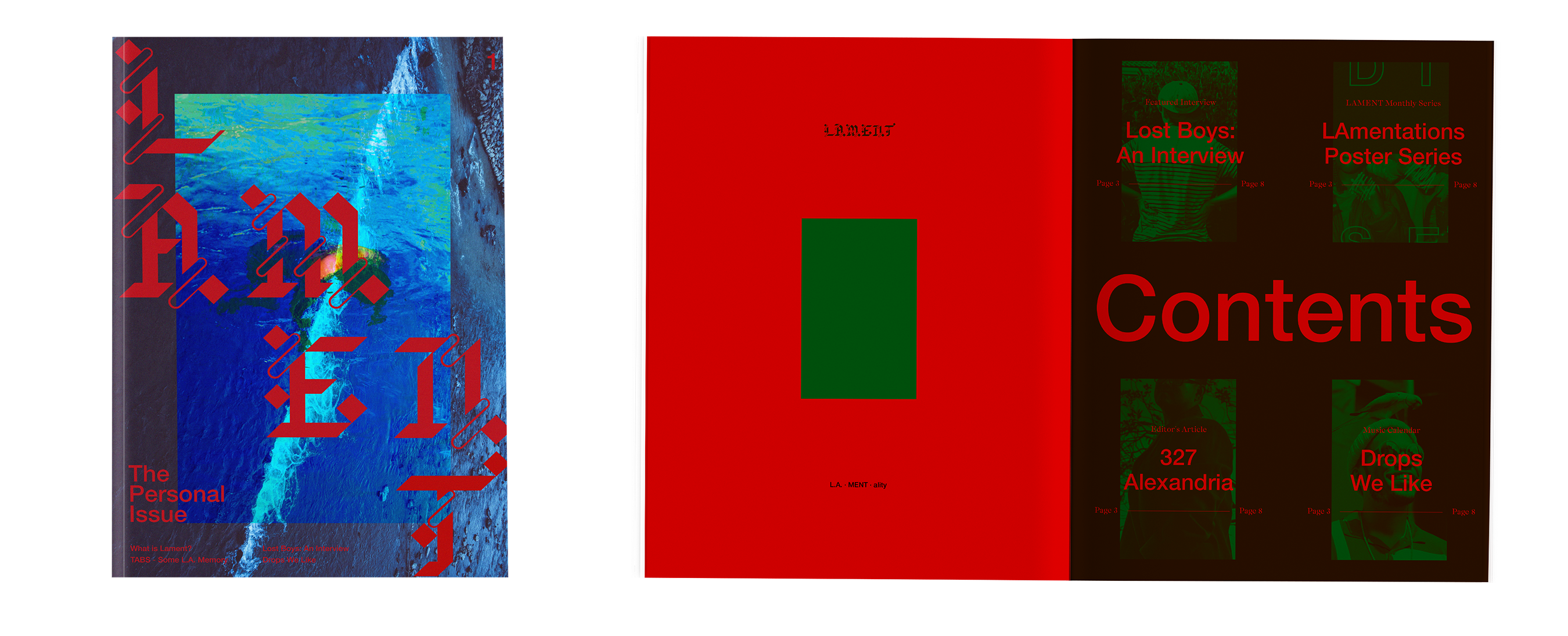
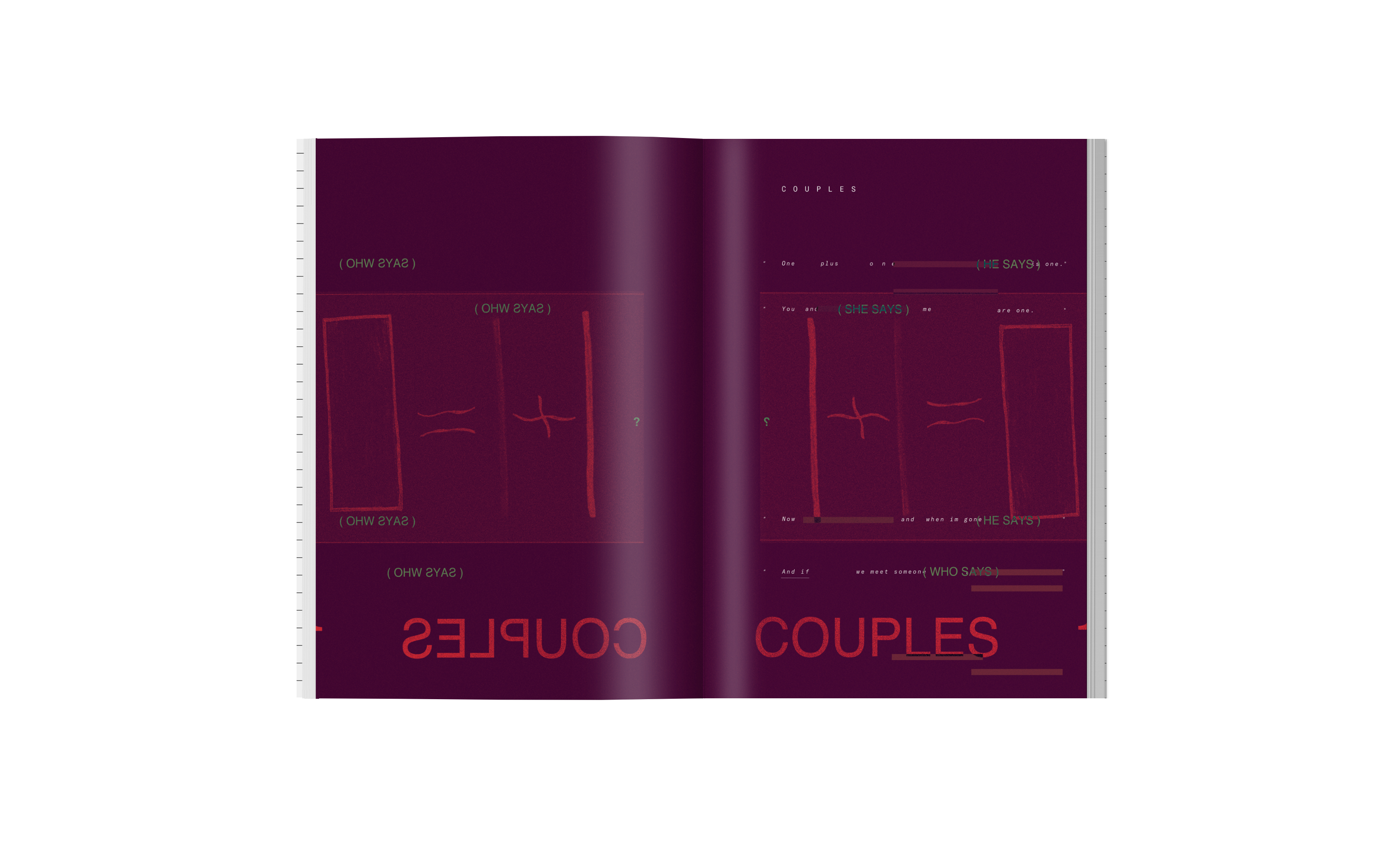
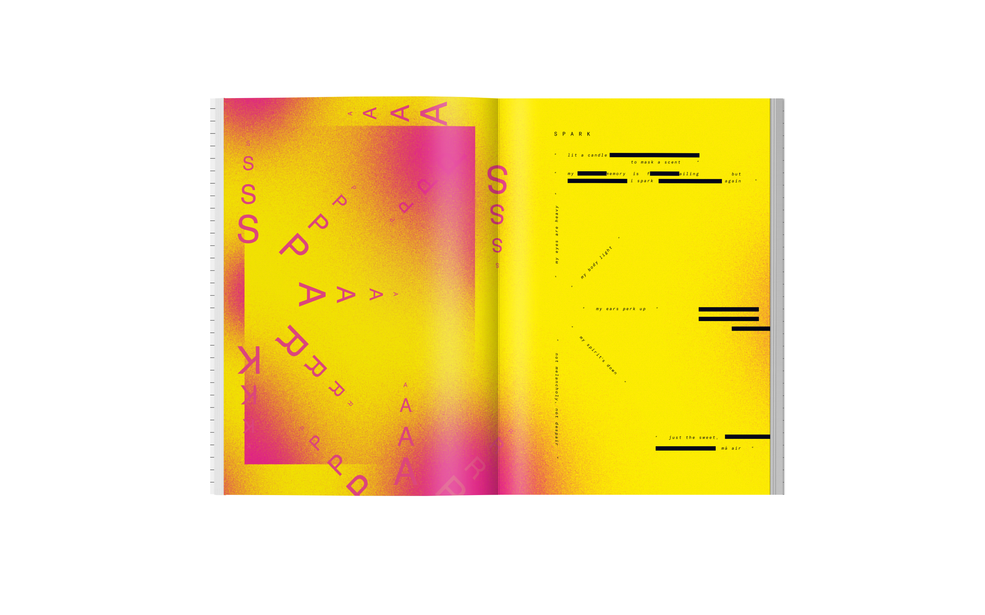
LAmentations Poster Series
LAmentations is a monthly series which focuses on a specific topic and invites the readers or other creatives to collaborate on a reflective piece.
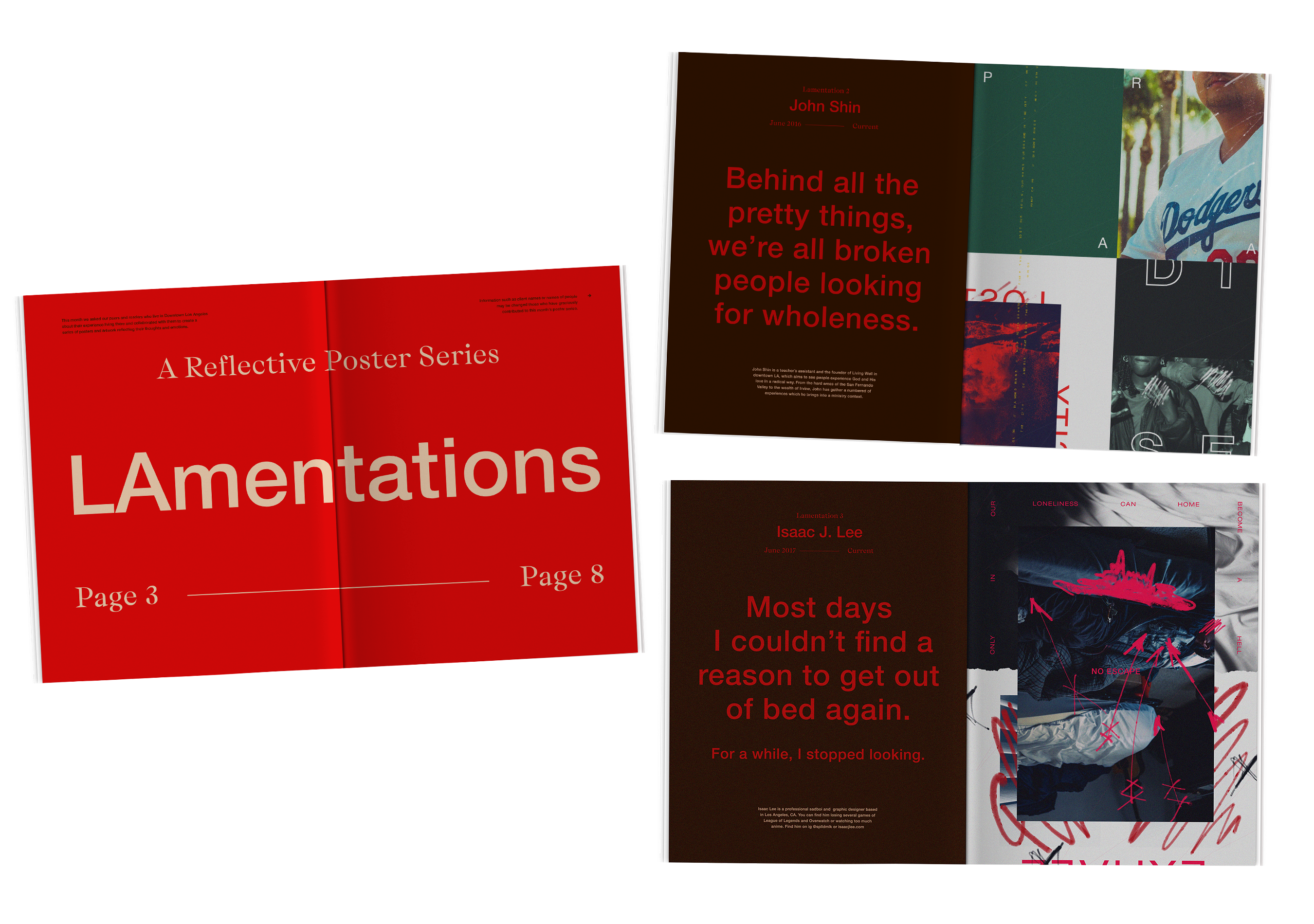
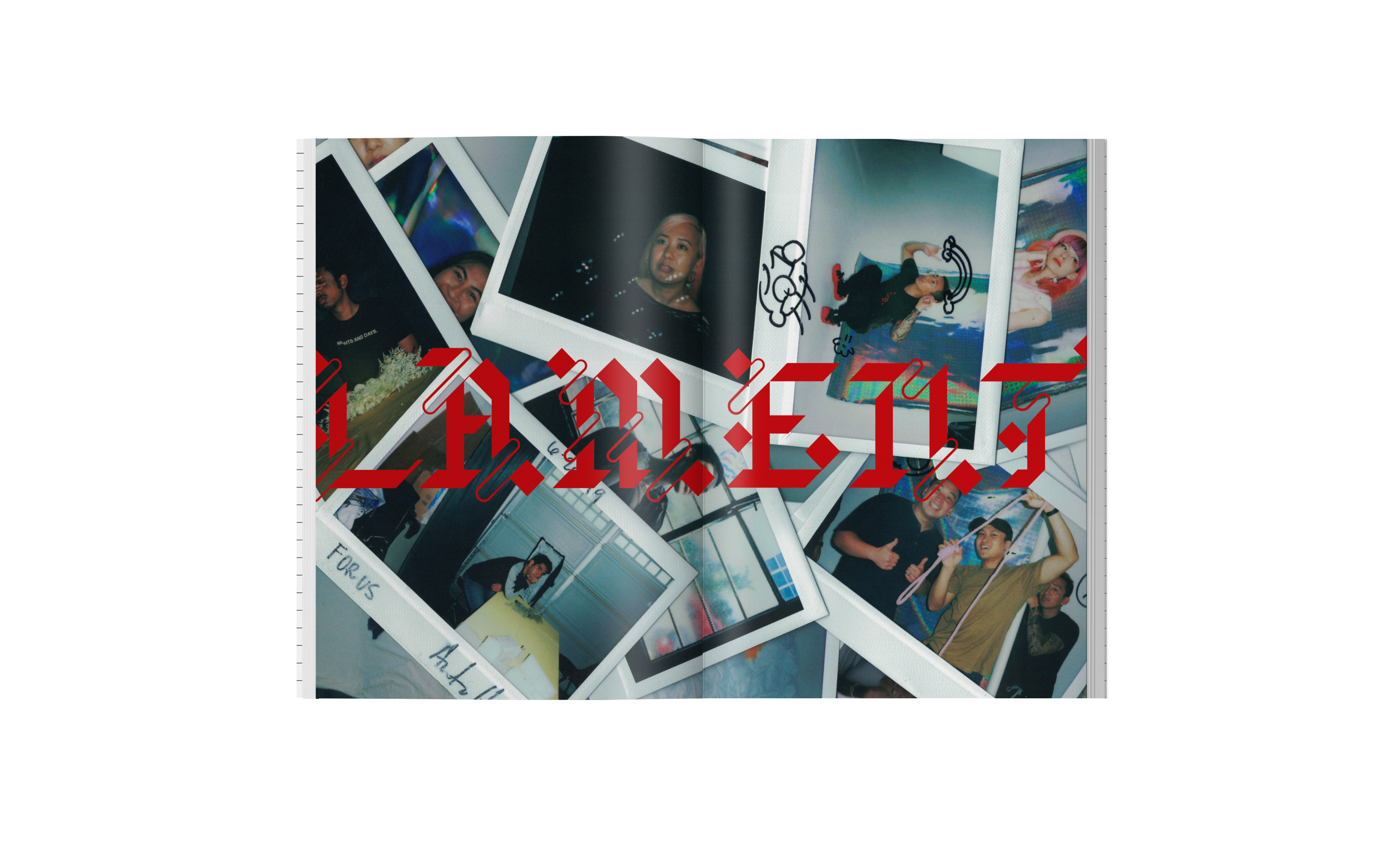
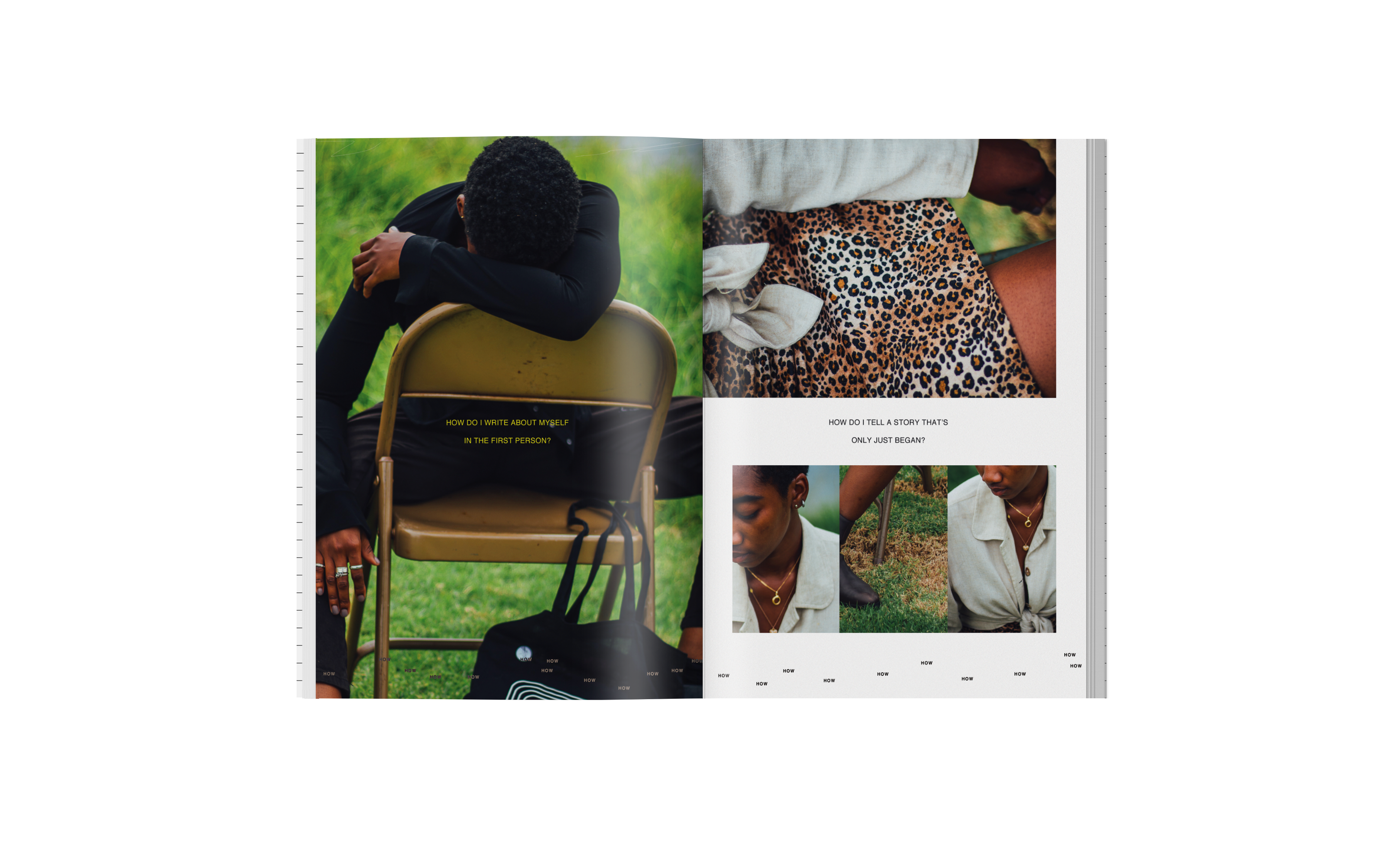
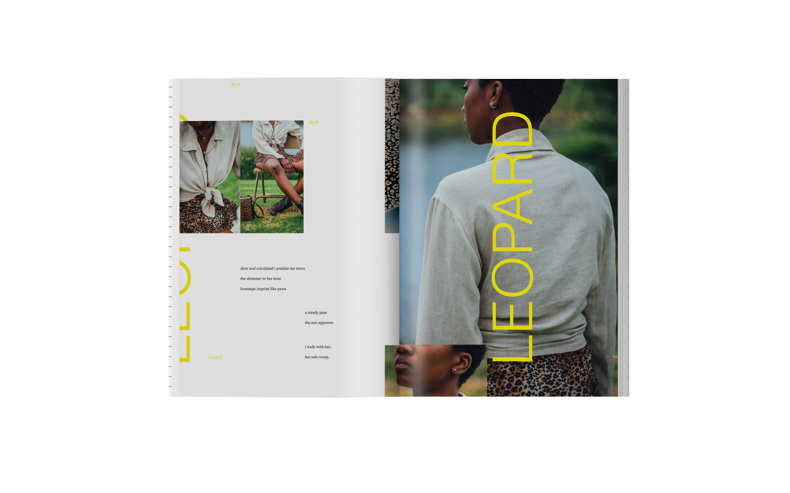
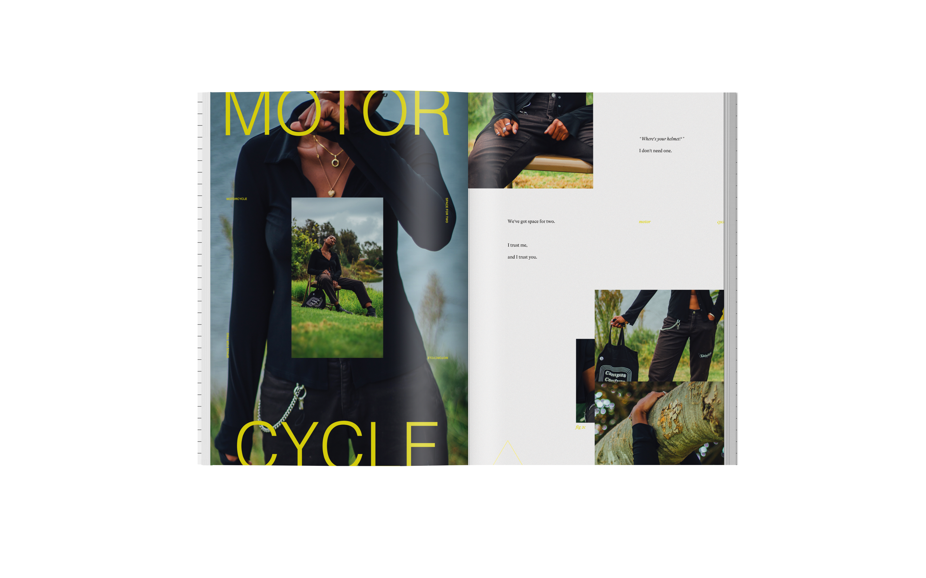
Feature Spread Examples


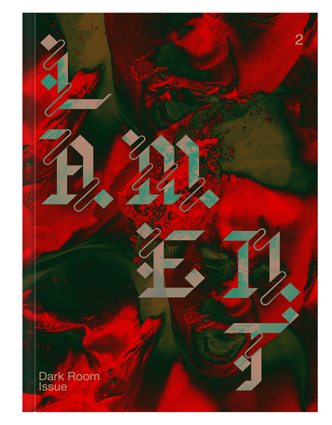
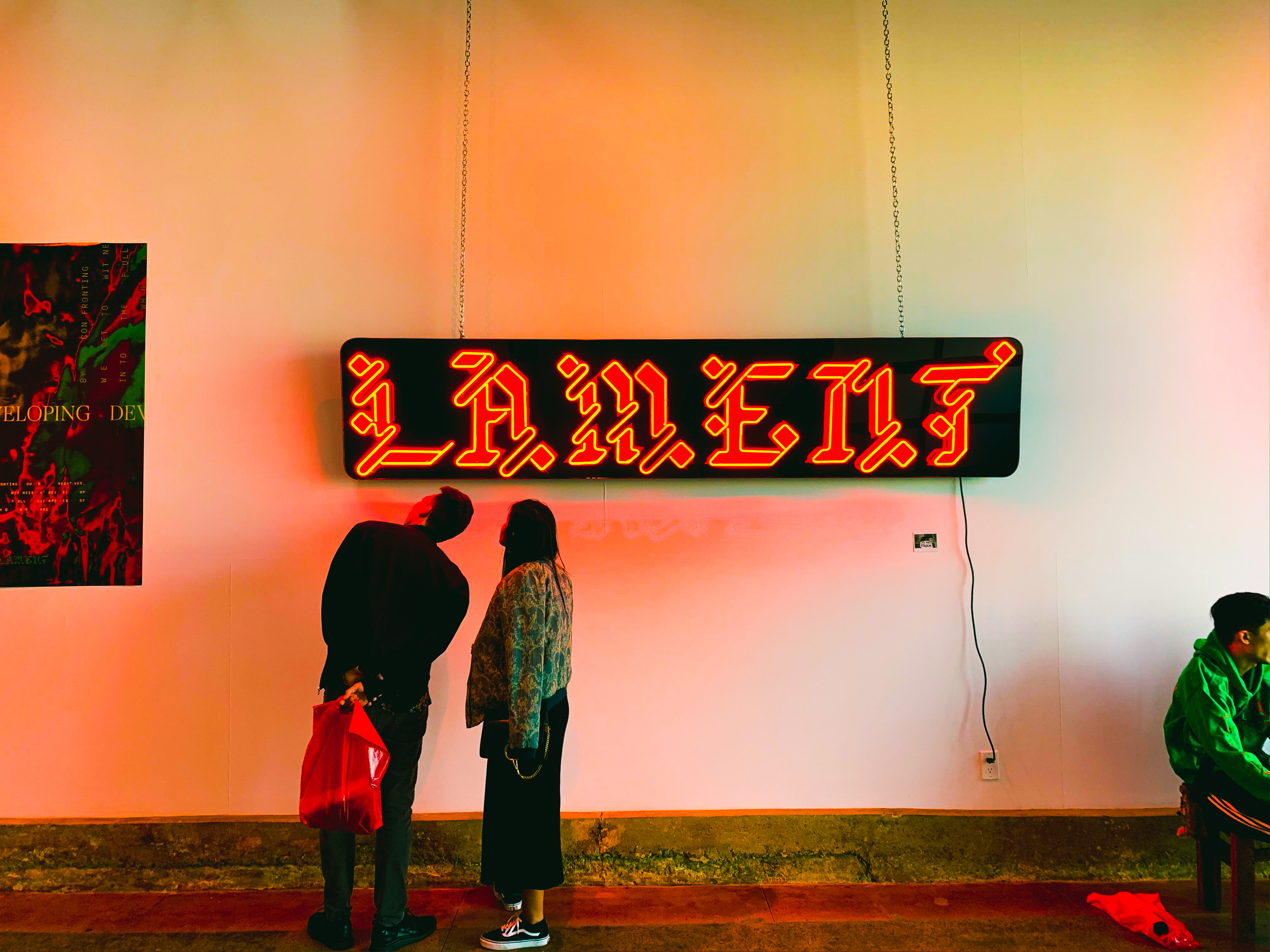
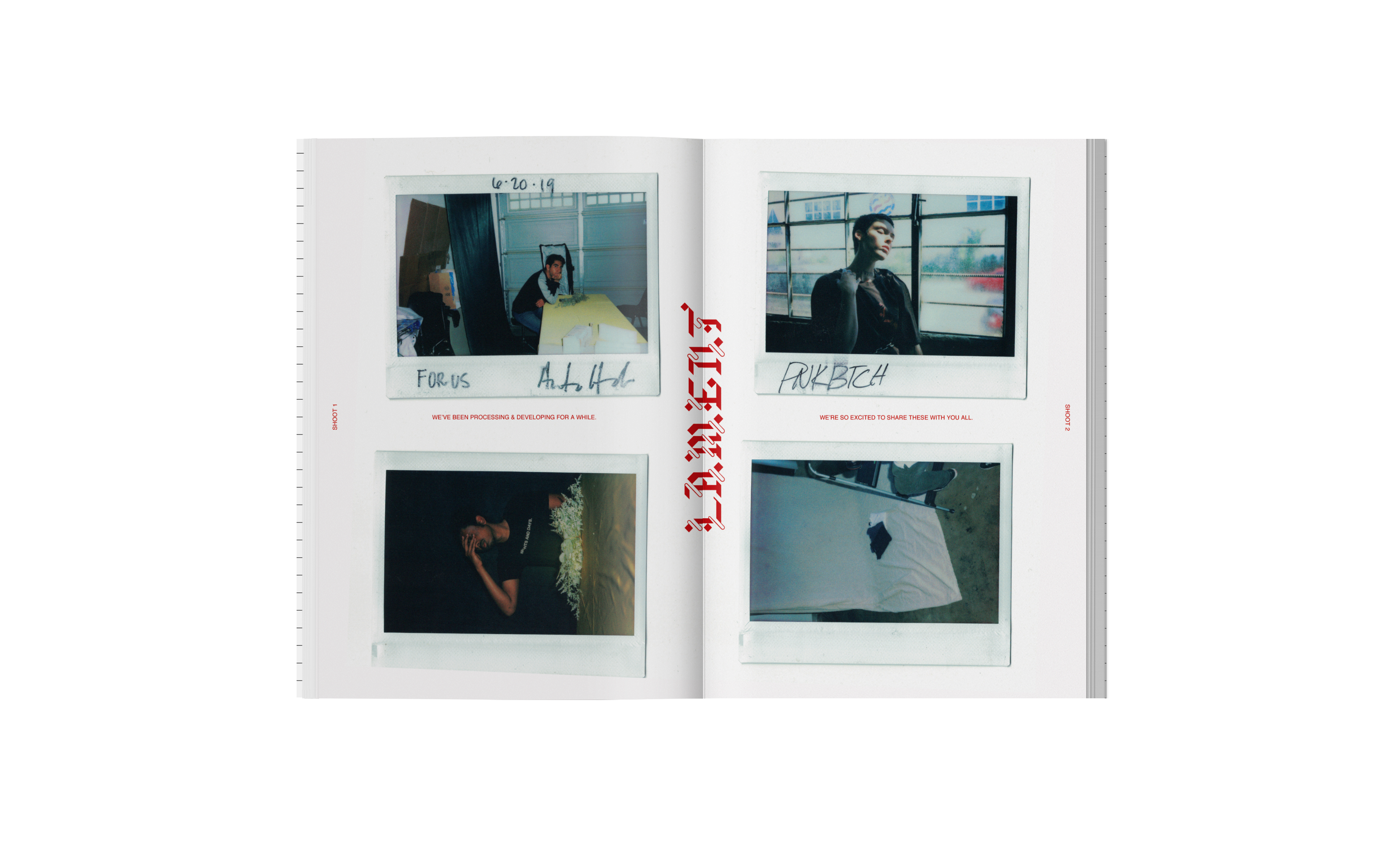
DARK ROOM Pop-up Event
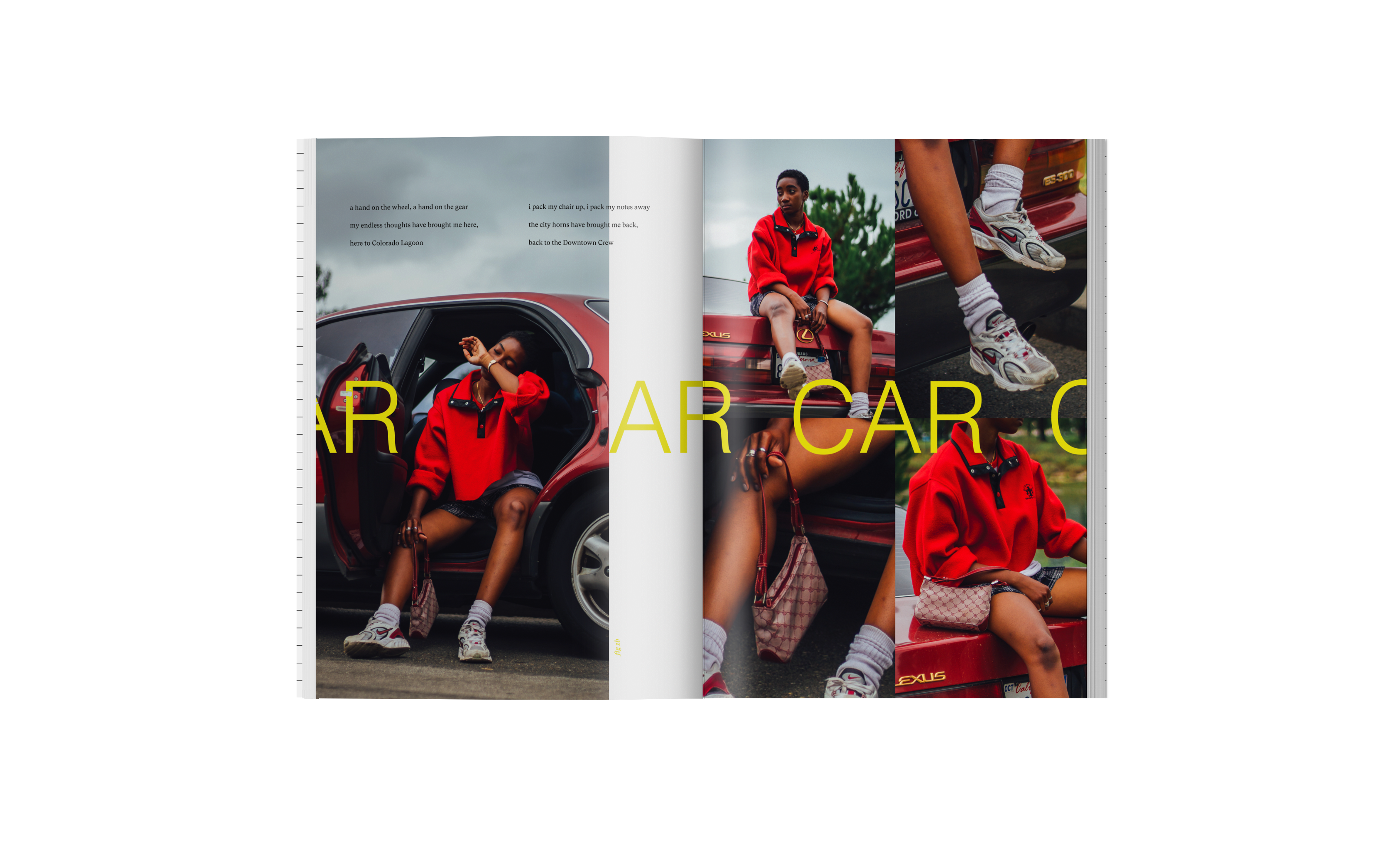
On November 15-16, I hosted and created a pop-up exhibit for the second issue of Lament Magazine. This issue I collaborated with multiple creatives by art directing photo shoots and designing spreads in the magazine with them.
“The DARK ROOM is where we're developed. In an era enamored with glamour, we play comparison and get paralyzed. We ignore our selves, numb our selves, beautify our selves. But then — we never develop. By processing our 'negatives,' we see and become full, real glimpses of our selves. The stuff of rinsing, soaking, drowning. Grimy, abrasive, reactive. Raw, jolting visceral. We're putting it up. Welcome to the DARK ROOM.”
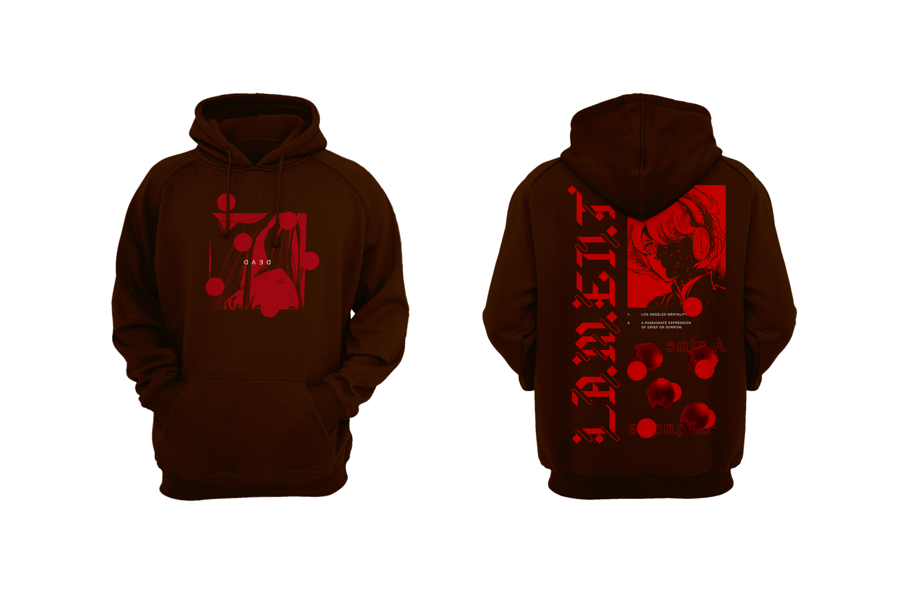
Merch Design


Magazine Design
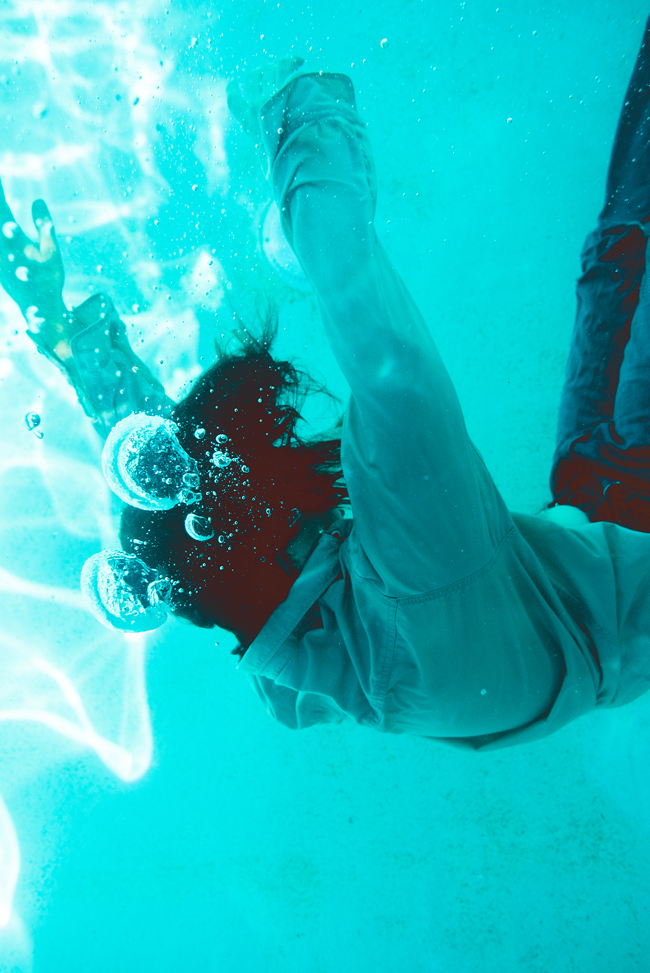
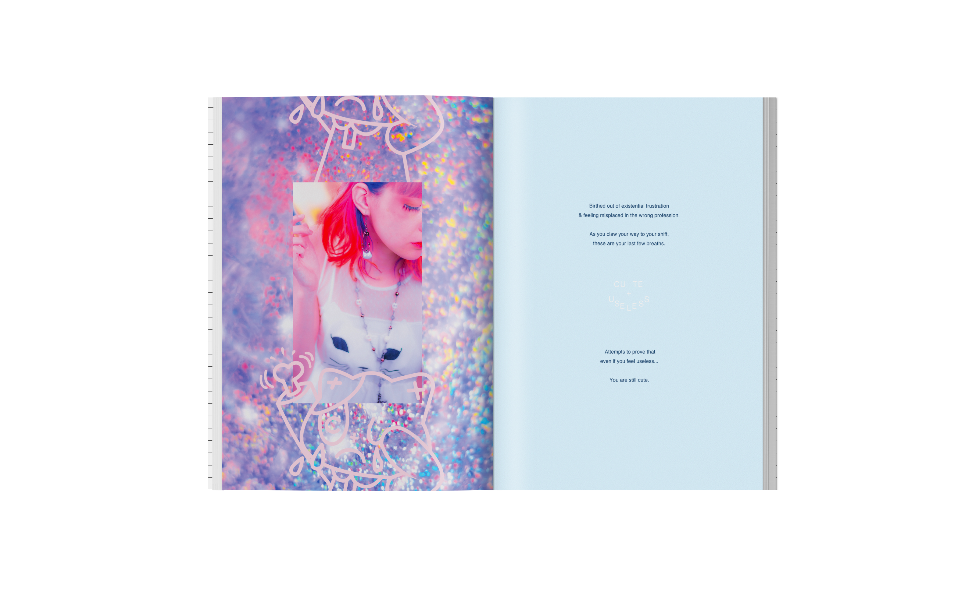
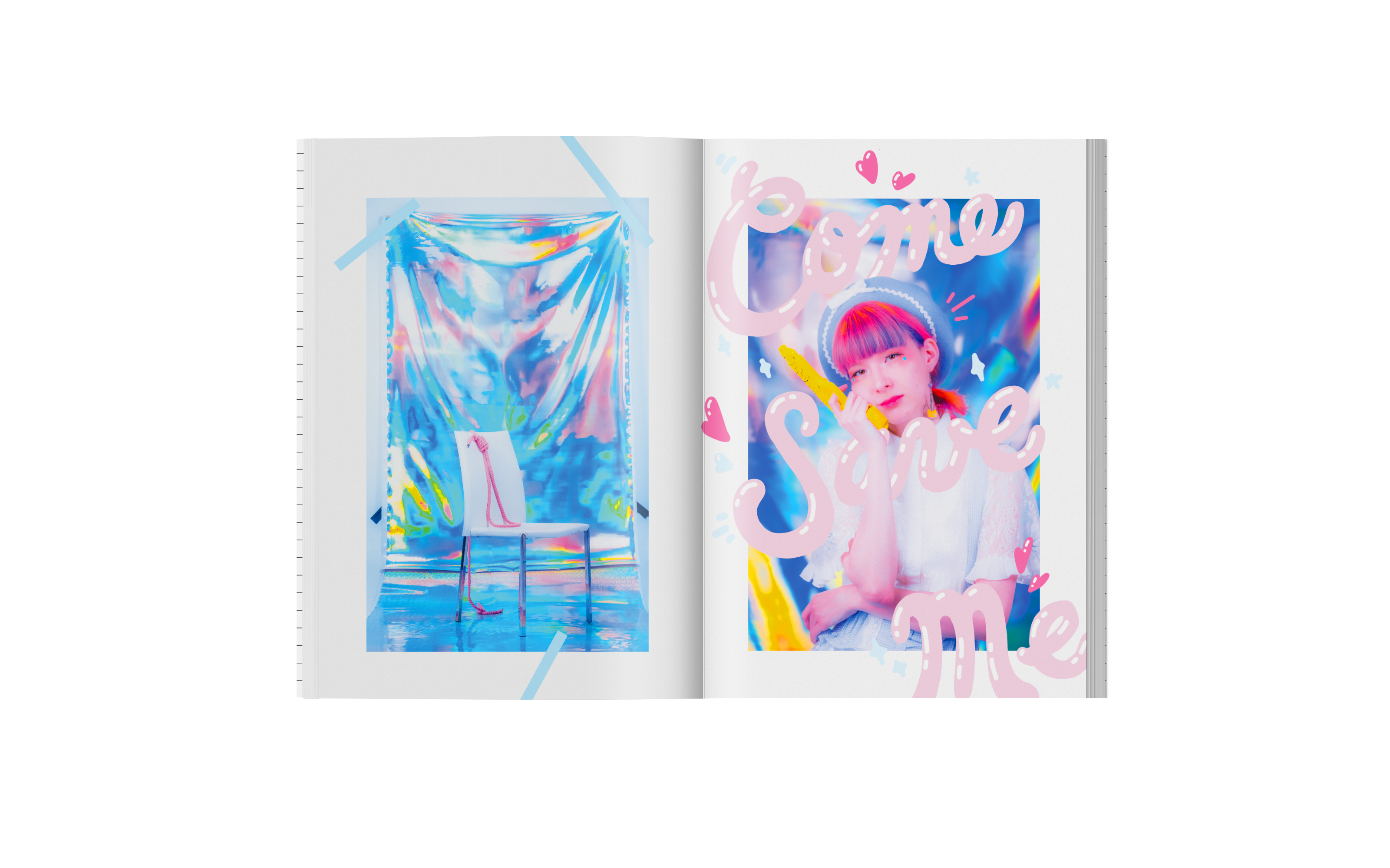
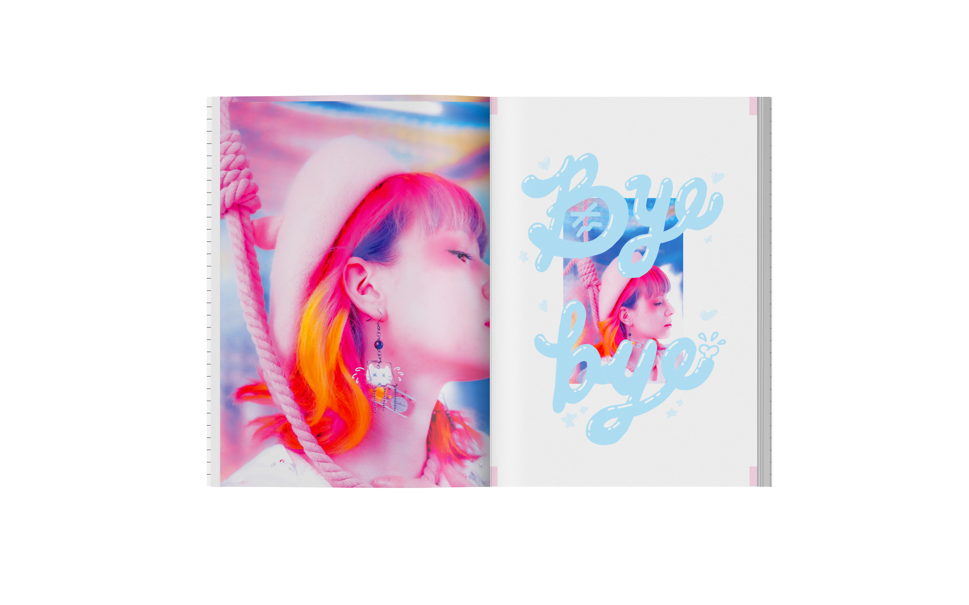
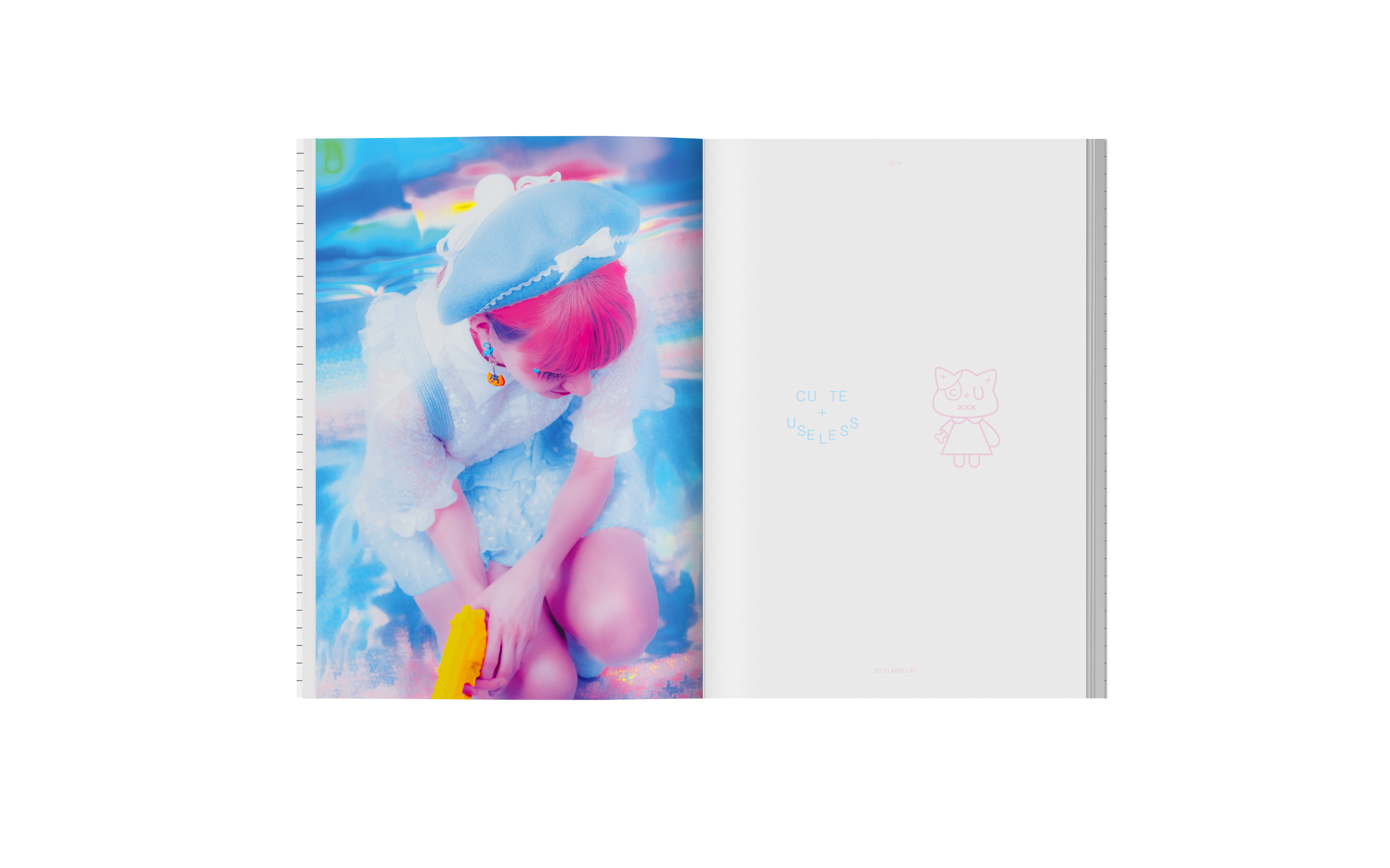
The art direction for the DARK ROOM issue uses the warm tones and inverted nature of film negatives. When negatives are treated incorrectly there is often distortion and light leaks that appear on the final product. It is those imperfections that make the photo more beauty than it’s original, undamaged nature, which we believe is the same in how humans are shaped often beautifully in the midst of trial. The main photography and front cover was shot underwater to reflect the overwhelming, existential turmoils that one faces while in that season.